Back to portfolio

UI/UX Design case study for Telstra

EDM and online billing portal

The Project

Telstra, Australia's largest telco, had been suffering from a lot of bad press.

Their response? A $2 billion digital transformation, with customer experience the key factor in all of their transactions with the public, at both retail and enterprise level.

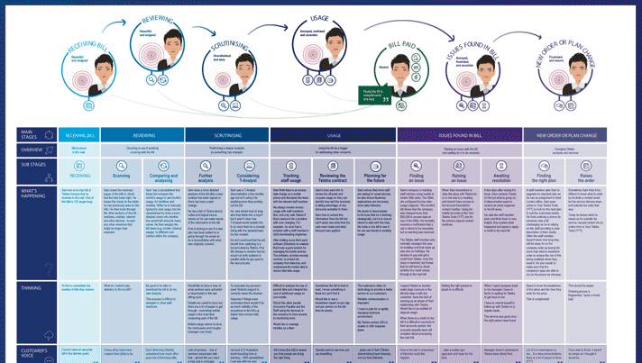
Many different channels were being tackled simultaneously at Telstra. I was the UX Designer for a small agile team (a product owner, a journey manager, a UX researcher, a BA, and myself), tasked with designing a new billing summary email and an associated online portal for one of their new products; Connected Work Place (CWP).

The Problem

Research indicated that, next to internet speeds and connectivity, billing was one of the biggest pain points for consumers at all levels. The focus for our project was mid-tier enterprise customers that were subscribed to CWP.

Most Australians have probably been the recipient of a Telstra bill at some point in their lives. Those bills (mostly received in paper format), often range from 2 to 10 pages in length. Customer feedback/prior research, and research conducted by our team, confirmed that the bills were generally considered incomprehensible.

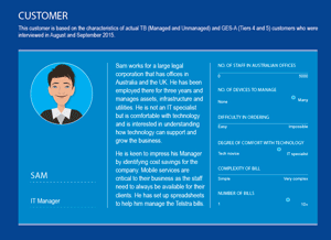
The enterprise level customers were receiving bills that were anywhere between 100 to 1000 pages long, and just as incomprehensible. Many of the enterprise customers we interviewed disclosed that they were employing third-party specialists just to help them reconcile their bill.

These lengthy paper invoices were also a pain point for Telstra, costing them around $20M a month to produce and mail.

The Solution

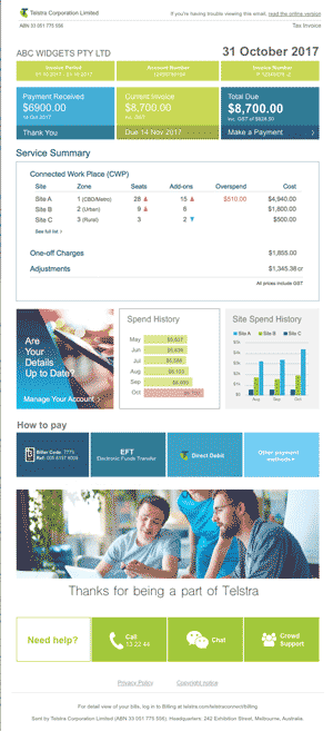
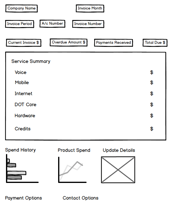
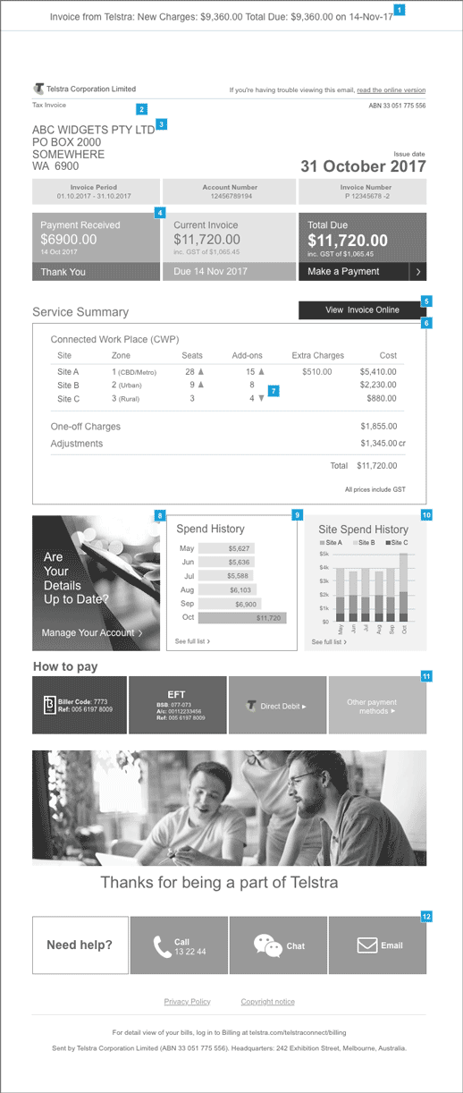
As part of a total redesign of the billing email we had the following goals:

  • Reduce the overall size of the billing summary (target 1-2 pages)
  • Only include essential account summary information
  • Ensure the information displayed was relevant and easily understandable
  • Take full advantage of the digital media format to provide links within the email to the online portal
  • Include callouts for significant spending changes
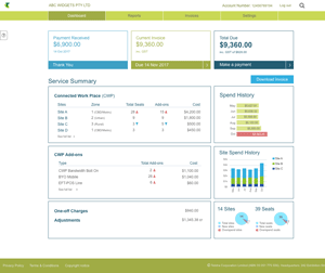
  • Create an online portal where customers could download a pdf version of their bill
  • Add value for the customer via the portal by providing access to additional information and enhanced features:
    • Multiple data download formats - csv, Excel etc.
    • Multiple data aggregation filters
    • Quick visual cues for key account statistics

The Process

Before we could start interviewing customers, we had to conduct a series of internal interviews, as no-one on the team, not even the Product Owner or the Journey Manager, knew anything about the product (CWP).

During this period, we also investigated existing Telstra billing procedures for other products, and met with other Telstra teams working on similar transformation projects. We were also able to source a number of competitor billing documents to help inform the design decisions.

We settled on a customer persona, and developed and clearly defined their journey.

With this information to guide us we were able to start the customer interviews and interviews with customer account managers.

We already had some idea of what needed to be included in the email summary, but conducted card sorting exercises, and multiple wire-frame iteration tests, to verify/discredit our thinking.

Due to the provocative nature of the subject of billing, finding participants for the customer interviews was relatively easy. Problems were encountered though, as often, even the customers didn't fully understand the product they were using. And it quickly became apparent that "incomprehensible" was indeed the correct adjective for the existing billing format.

Many of the interview findings played out as expected but there were a few surprises. The UX process definitely proved its value as we zeroed in on what the customers really wanted/needed; a concise, understandable bill with location based data, and alerts for any significant changes to costs.

Before long we were able to perform iterative prototype tests with the customers and the final prototype was handed off to the developers by the due date.

The Product

The prototype went through multiple iterations (sometimes daily). The main layout changes were between a horizontal and vertical format for the key invoice summary items - Payments Received, Current Due and Total Due. The favourite for most customers was the horizontal format because it was easier to scan and quickly see the most key information.

Some of the main design decisions are listed below:

1Thanks to competitor research, we discovered that users liked the idea of a subject line that included the current bill amount, meaning they didn't have to even open the email if the figure was close to the usual amount.

2Including a personal salutation was tried but testing deemed it unnecessary for enterprise customers.

3Removing the company address, because this was an email, was also tried but testing revealed that customers found it beneficial to ensure the bill was going to the correct location.

4When there were no payments received, this box would display the overdue amount and date.

5A "View Invoice Online" button was found to be necessary to emphasise that there was an online portal where more information could be accessed.

6The Service Summary section was pared down to the barest minimum while still retaining the most relevant information that customers requested. Almost all interviewees said they preferred the information to be presented via location (site).

7Callouts in the form of coloured up and down arrows were included to draw attention to changes in the customer's spending.

8A visual/textual element was included as a reminder that they were able to check/update their details online.

9To add value, a 6-month spend history was included with a visual callout that would alert to any significant changes in spending over that period.

10An additional value-added feature was a spend by site stacked bar graph for the customers top 3 sites (by spend).

11Easy to follow visual reminders on how to pay with included payment references.

12A list of preferred (by customers) methods of contacting Telstra in the event of problems arising.

A future iteration of this website will include a review of the portal - maybe :)

Back to portfolio

Contact

Like what you’ve seen? Fill in the form below so we can get together and discuss the possibilities.